Peter Larsen Formalet Kaffe
I had the privilege to work together with the amazing Simply Branddesign on the redesign for Peter Larsen Kaffe, a well-known Danish coffee brand located in Viborg. The iconic coffee pot 'Madam Blå' is almost a hallmark of the city and is located right outside the Peter Larsen factory. It naturally became the prominent graphic element of the packaging design in combination with the recipe numbers from the old packaging design. The ground coffee series comes in six different variants and colors.
Packaging Design / Agency : Simply Branddesign / Graphic designer Line arlander
Delitaste
Logo & visuel identitetDelitaste og Stryhns Gruppen samler foodservice-aktiviteterne og kommer nu med et af markedets bredeste udvalg af smagsoplevelser. De skulle derfor have udviklet et opdateret logo og samlet visuelt udtryk på baggrund af den nuværende delitaste identitet og tidligere udviklet materiale til Stryhns gruppen. Agency: Simply Branddesign


Visual Identity / Agency : Simply Branddesign / 2022
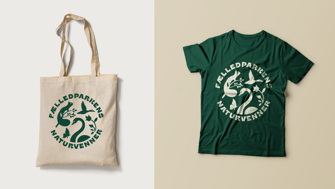
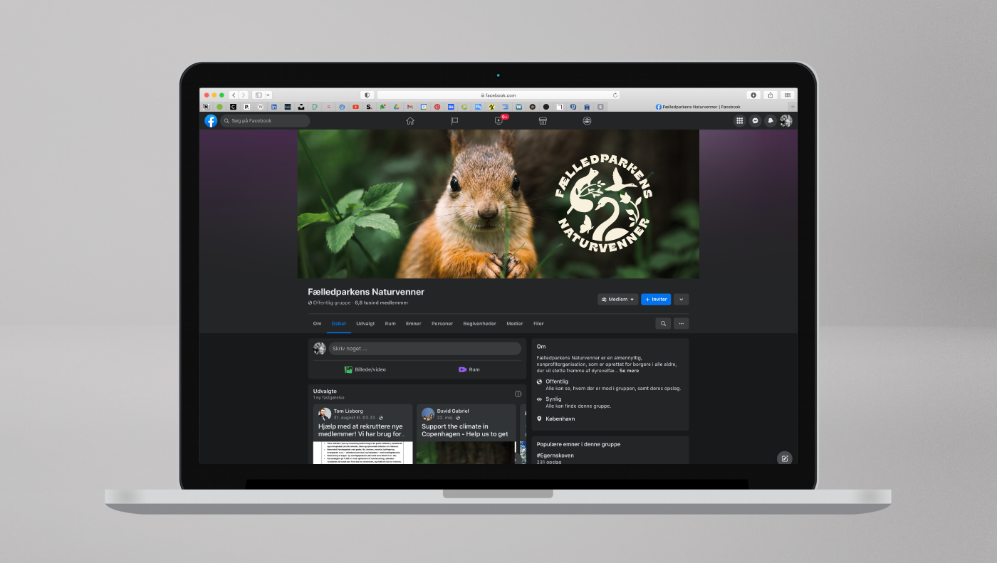
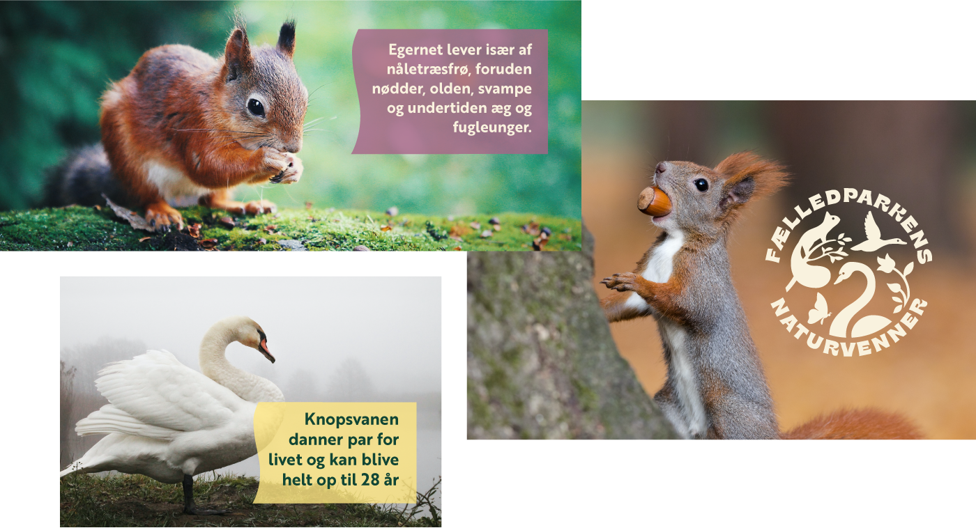
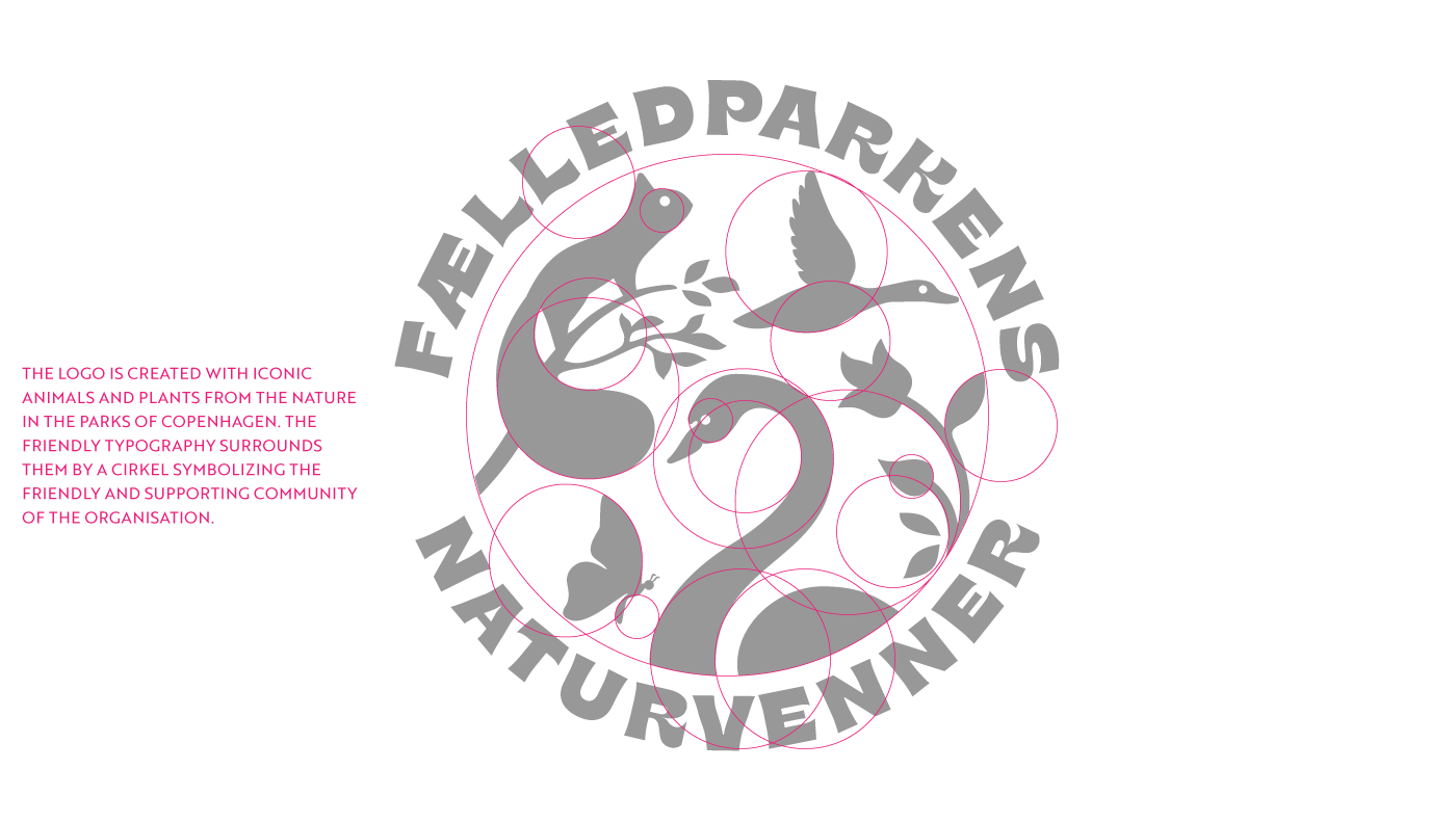
Fælledparkens Naturvenner
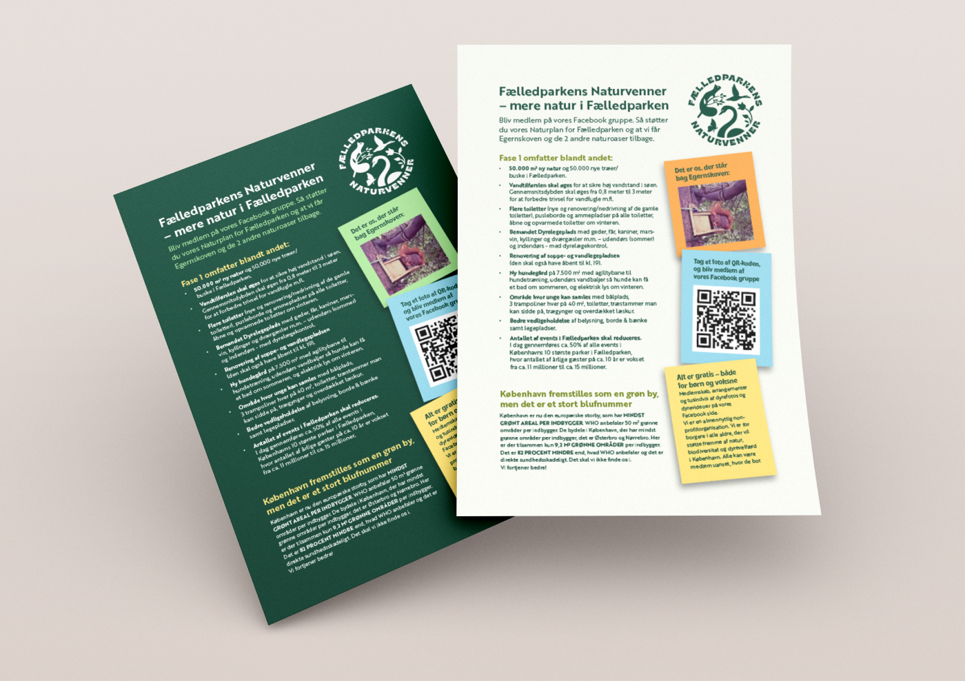
Logo & identitetFælledparkens Naturvenner er en non-profit organisation, der arbejder for at få mere natur til Københavnerne.


Identity Design 2022 / arlander.dk
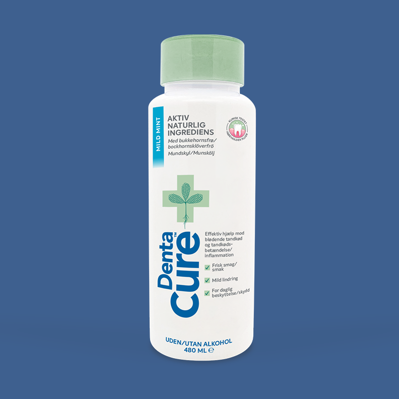
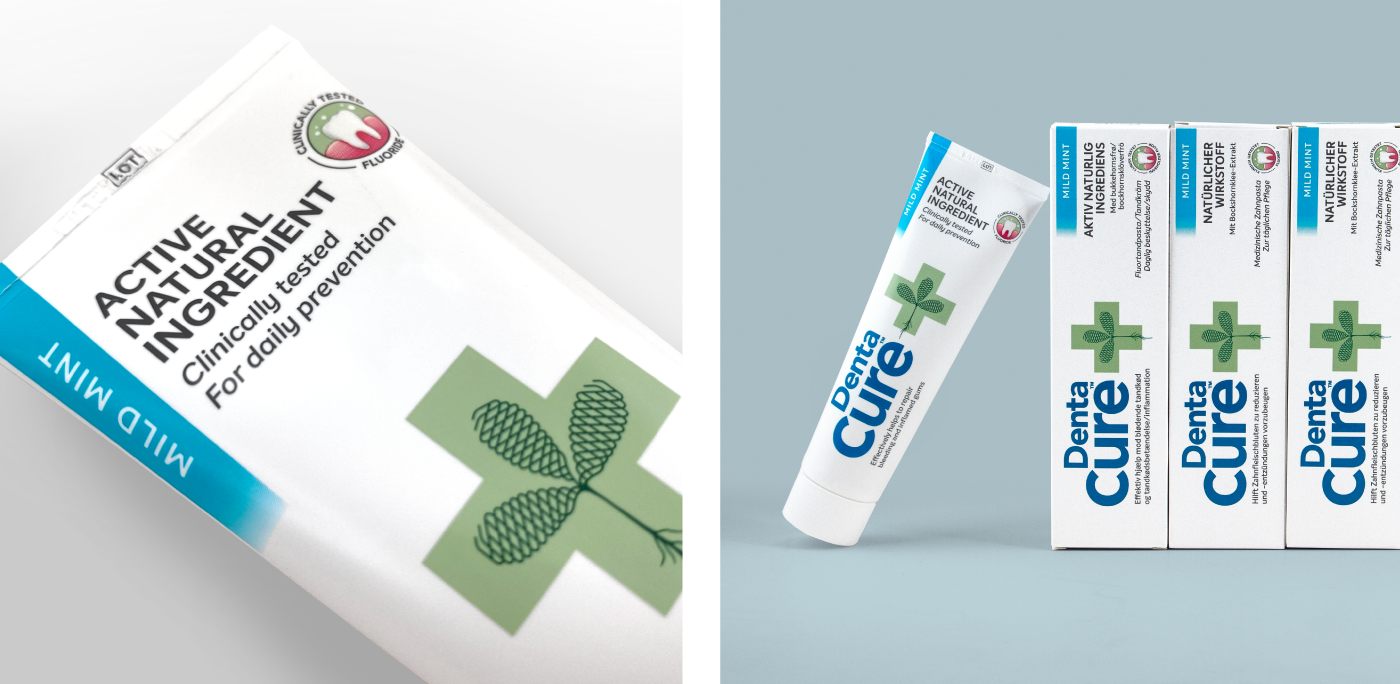
DentaCure
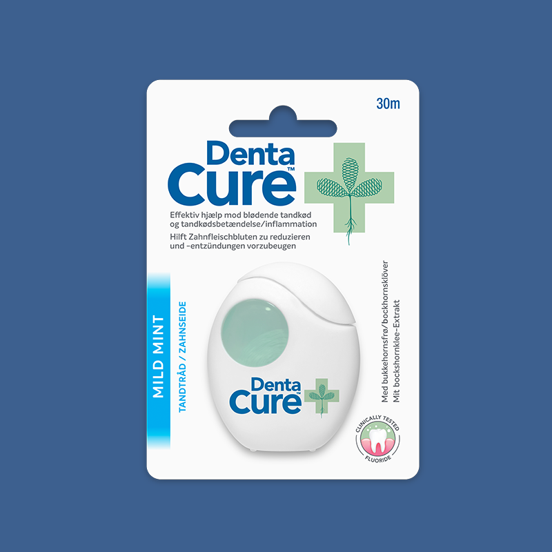
Identity and packaging design for toothpaste, mouthwash & dental floss
Identitet og emballage design til tandpasta, mundskyl & tandtråd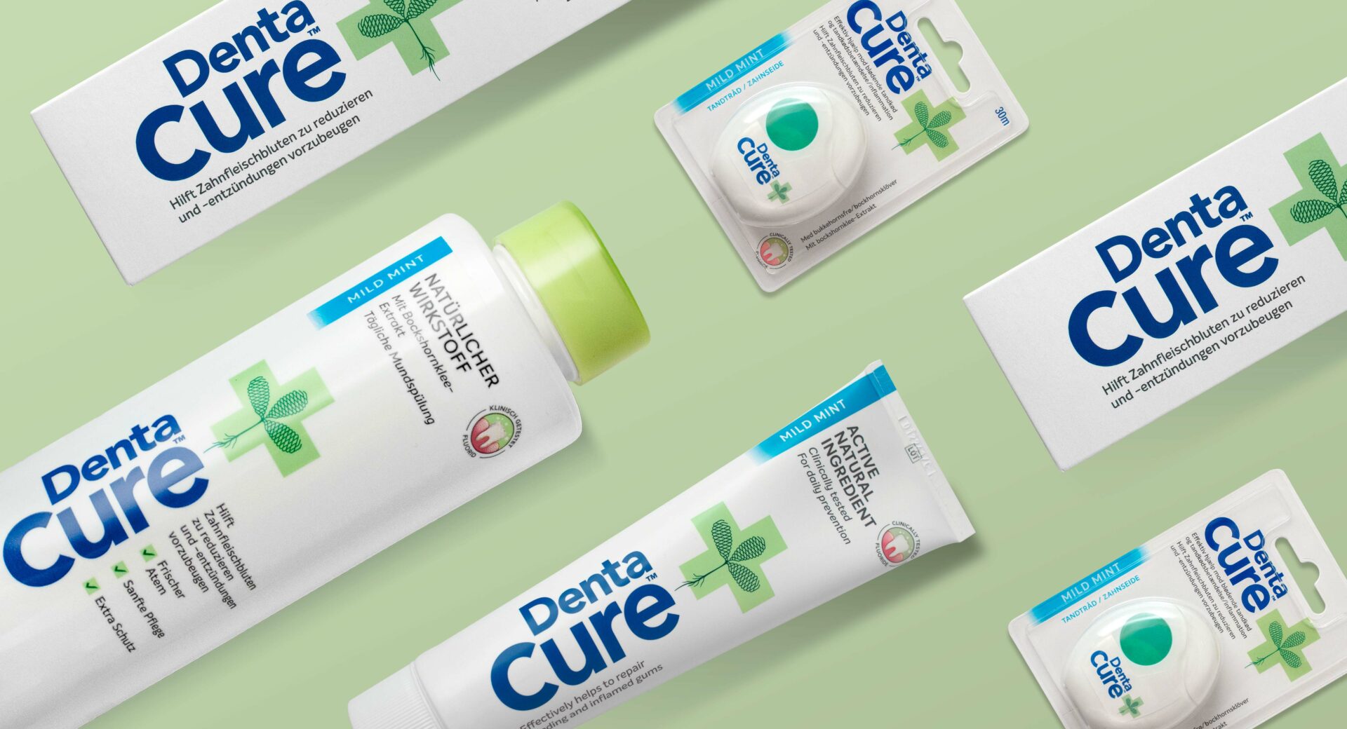
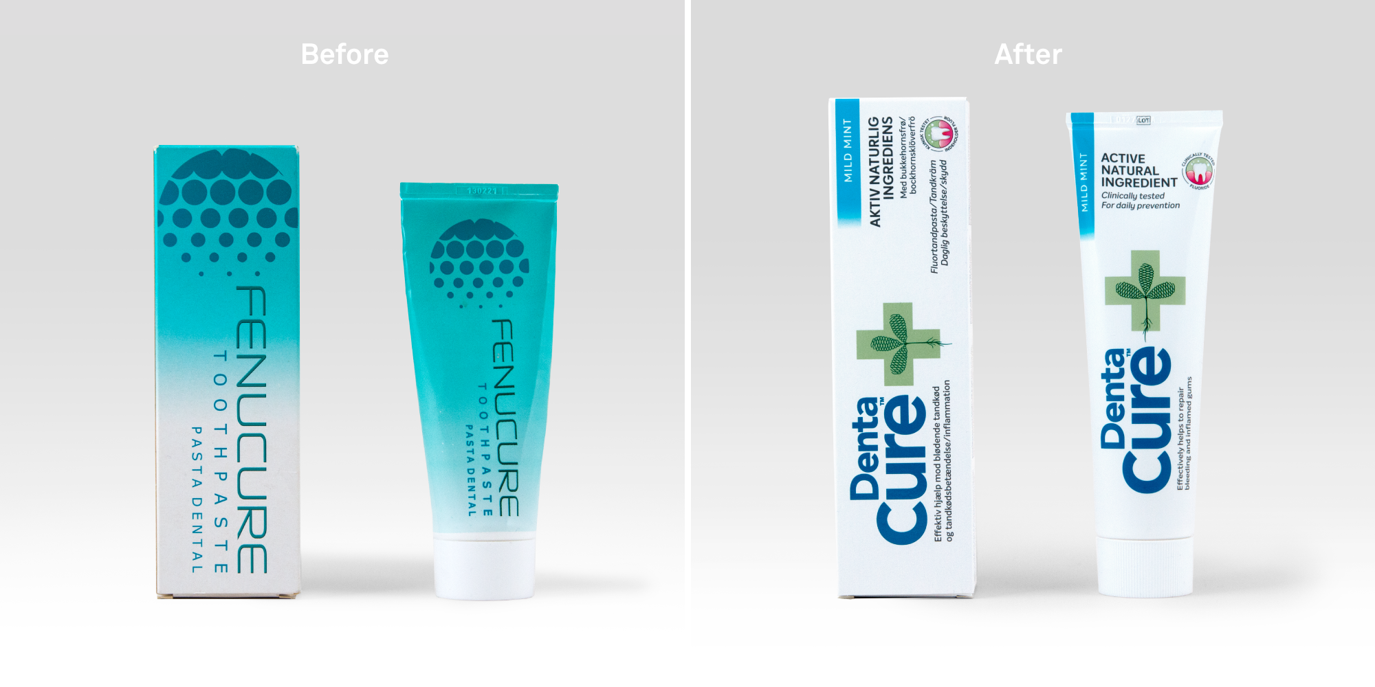
For many years, Fenucure Medical have developed products for oral hygiene based on the seeds from the fenugreek plant. The plant is known for its healing and anti-inflammatory effect and is therefore a natural yet effective remedy for the harmful bacteria causing gum problems.
The DentaCure products all contains a naturally active extract of fenugreek seeds, which through millennia has been known for its healing effect. Back in 2017, DentaCure was tested by professor Marie Paulis from New Haven University. The test documented that DentaCure has an effective effect on both bleeding gums and gingivitis as well as proved that inflammation of the gums was reduced by using the toothpaste, compared to a placebo toothpaste.
The intersection between the documented clinical approach and the natural ingredient became the focal point of the new brand design as well as the strategic starting point for our work with DentaCure. Strategist Peter Galler shares some of his considerations from the process: “Being a medical company, with an herb as the primary active ingredient, presented a few interesting strategic considerations in regard to positioning. Do we want to be the “effective alternative in the natural shelf” or “natural alternative in the effective shelf”, and how can we counter-balance design to provide instinctively understandable proposition at shelf?”
The design conventions for efficient and trustworthy oral hygiene products became dominant with a clean and white expression, combined with a key visual element telling the brand DNA in a clear and easily decoded symbol.
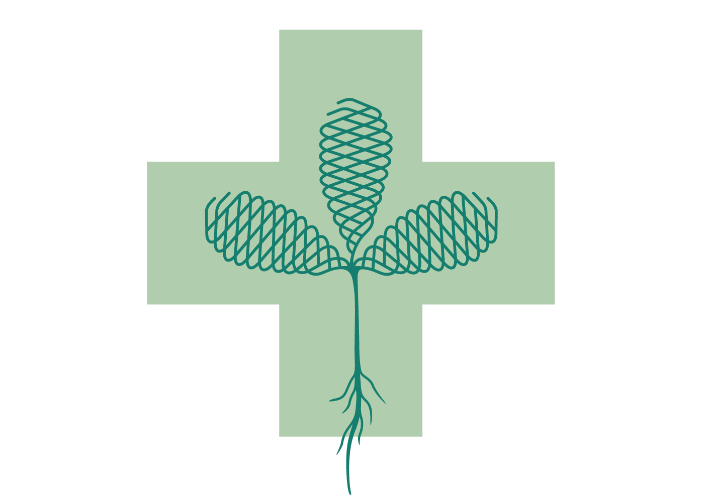
”The green cross, which is instinctively decoded as ‘pharmacy’ or first aid, encounters an optically 3-dimensional precisely drawn fenugreek plant, whose expression is based on a combination of old medicine books and the precision and technology associated with the extraction and manufacturing process of the patented plant extract. Technology and nature unite in one symbol,” explains senior designer Line Arlander.
Scalepoint Technologies
Kravlenisser og illustrationer til juleeventyr for Scalepoint Technologies.
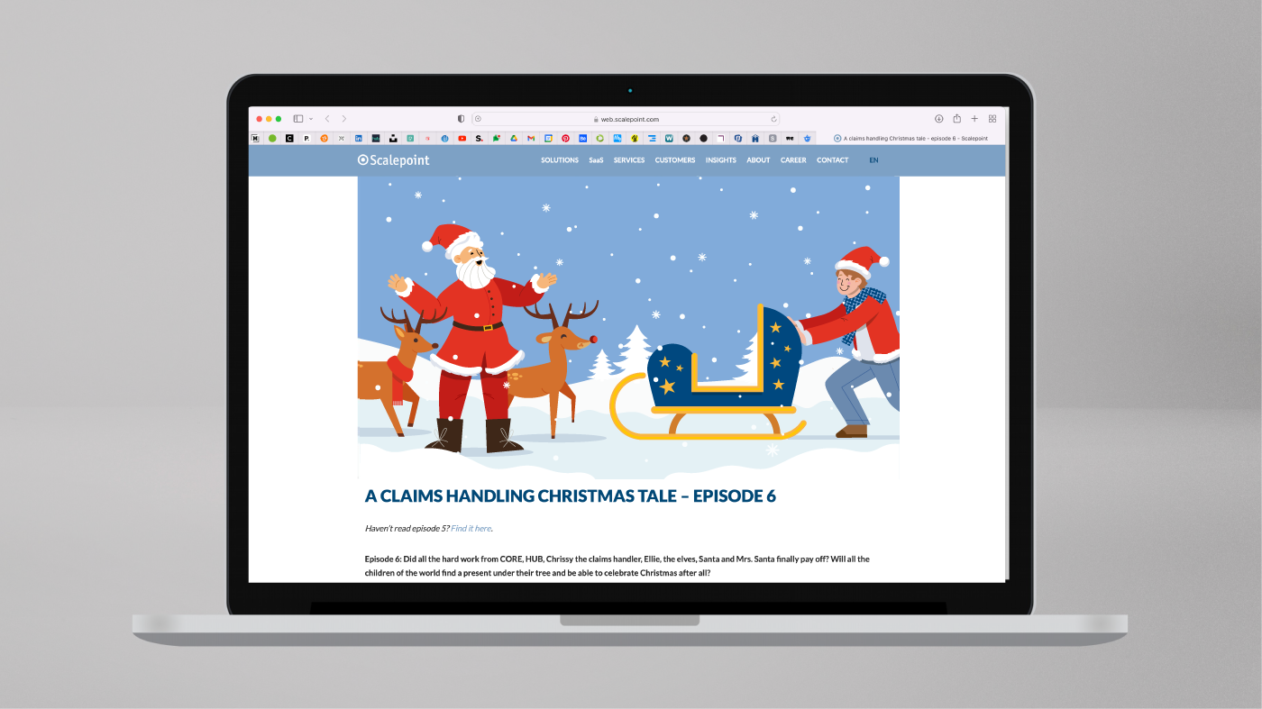


Illustrations 2022 / arlander.dk