Arla Riberhus
Brand identity and packaging design for the wellknown danish cheese brand Riberhus
Logo, emballage design og implementering til hele Riberhus ost familien


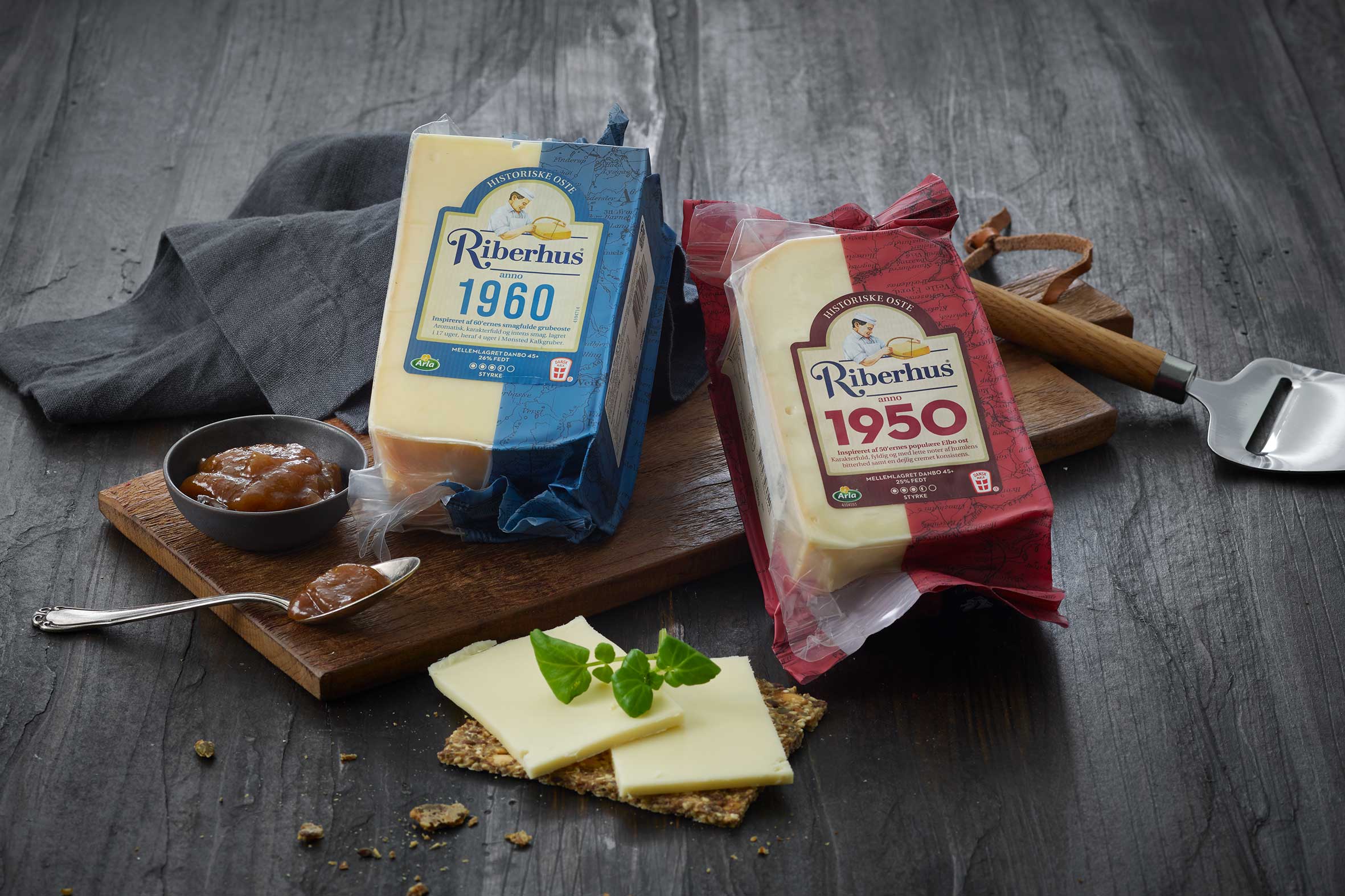
The Arla brand "Riberhus" has existed as a brand since 1973 and have a heritage back from Ribe, a small danish city. The strong and historical craftmanship-DNA had to be even more clear to ensure the positioning of the brand in the future.
At the same time, consumers needed to be able to find their favorite variant easier, as color coding in almost all products looked too similar an inconsistent.
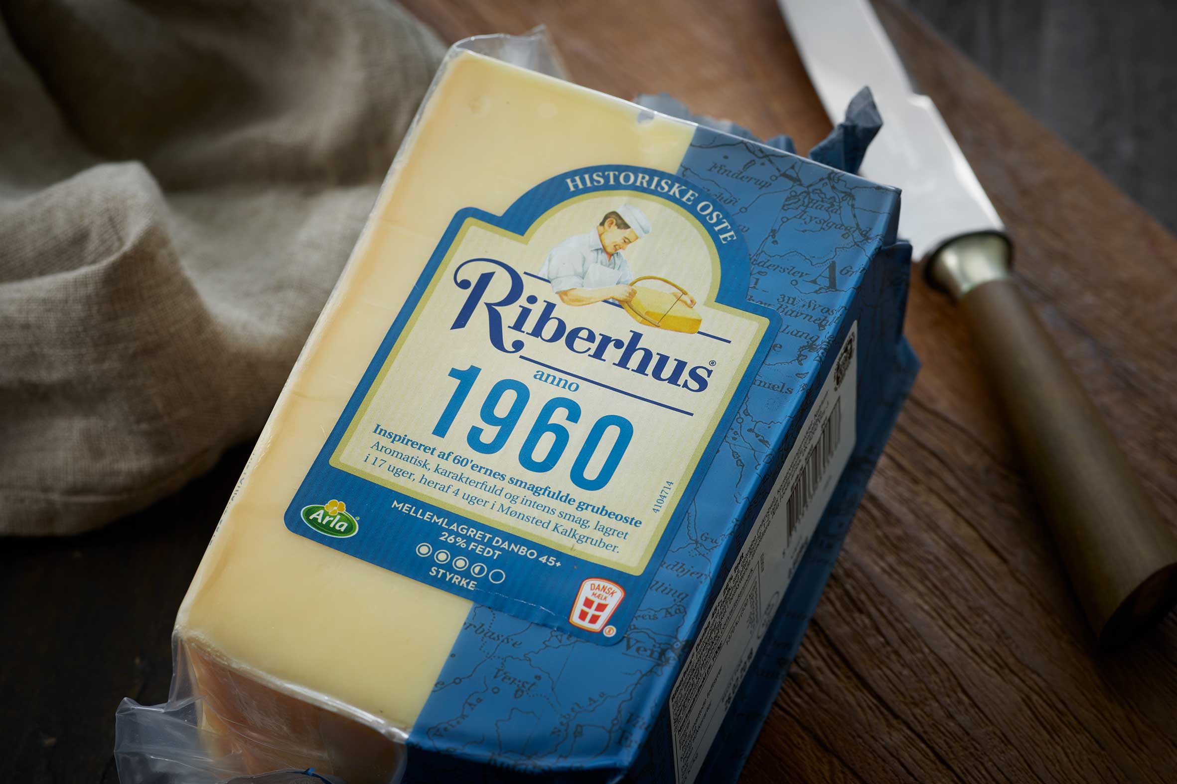
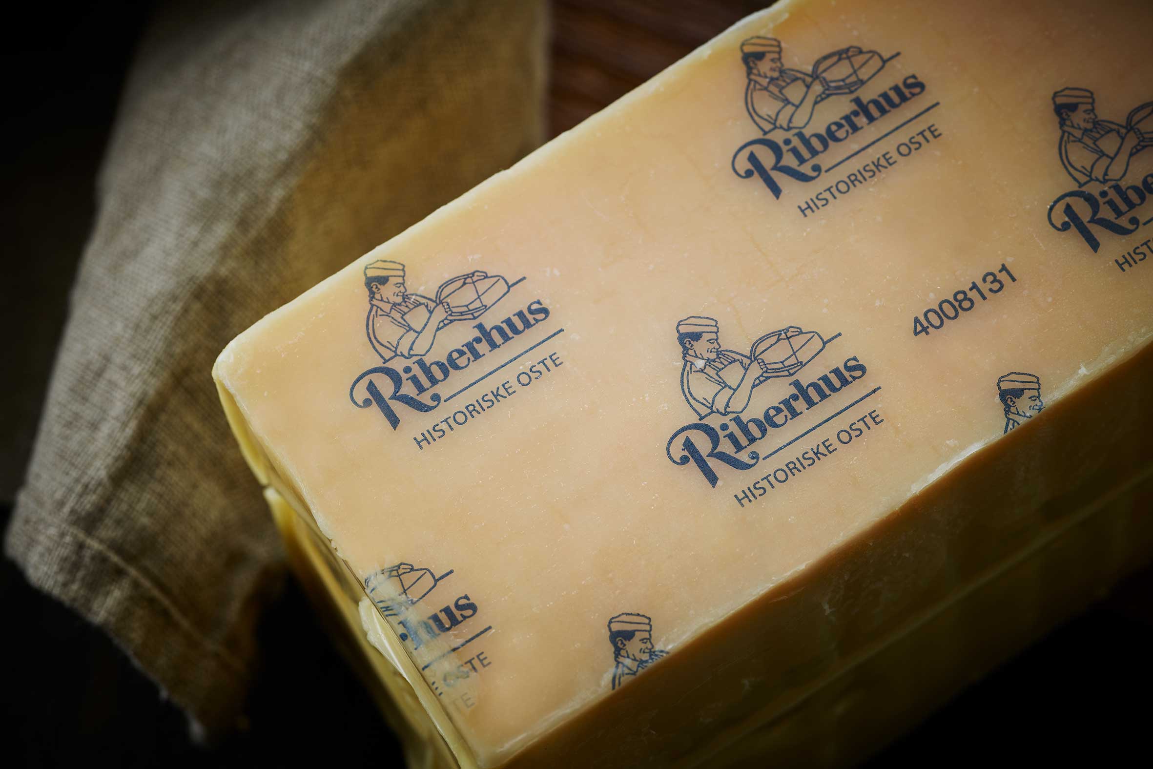
Both the Riberhus logo and the illustration of the "cheesemaker" has been re-worked, with respect for the heritage and recognition of the brand. The illustration of the "cheesemaker" was moved to a more dominant position in top of the label in direct connection with the Riberhus logo, and the shape of the label.
As the portfolio of products are very broad in both formats and materials, it was needed to develop a system to hold everything from corerange products to smaller subrange products - B2B products and special editions, to make sure they had a strong and consistent look to allover.
Packaging design / Agency : IDnaGroup
Photo: Lars Ranek
